November 5, 2024

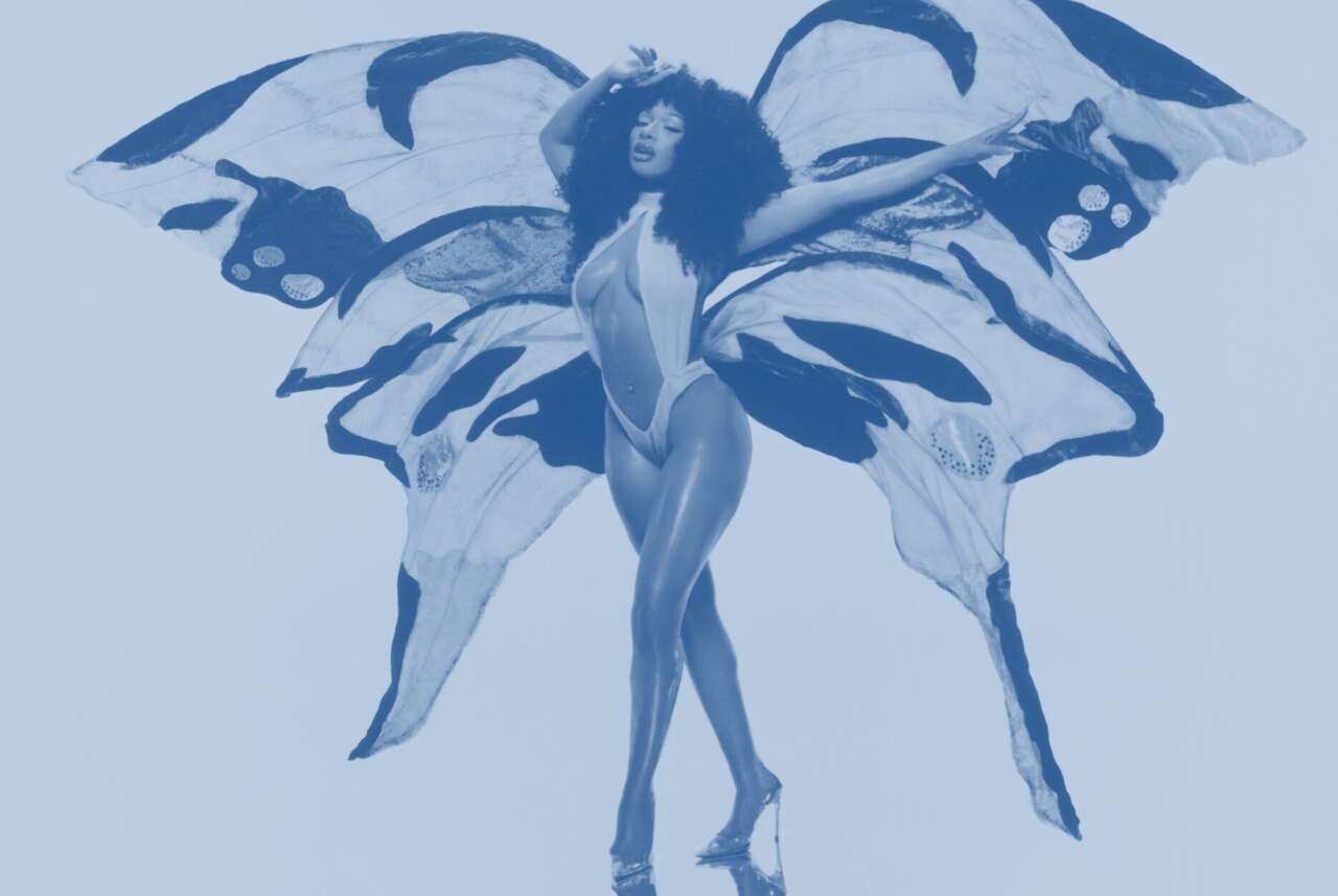
How Megan Thee Stallion's new album cover is a nod to this Houston hip-hop throwback
Late last month, Houston rapper Megan Thee Stallion released "Megan: Act II."
The album sounds like a homecoming release of sorts, an artist recognizing her roots, having recently conquered the world with No. 1 singles and albums.
While she's very much a peak performer in the present, for the album's cover, Megan opted for a throwback to a previous aesthetic era that was also born and raised in Houston. The cover is dominated by what appears to be a gleaming, grill-clad set of teeth with a couple of inlaid butterflies. The typeface — "MEGAN" and "ACT II" in capped, diamond-encrusted letters — was a throwback nod to a local institution, Houston's Pen & Pixel design firm.
The company, known for its graphics that sparkled and gleamed, designed more than 19,000 album covers for more than 6,000 acts in the 1990s.
And it all started when two brothers set up their company on a single computer on the kitchen table of their apartment along Memorial Parkway.
New sounds, a new look
Pen & Pixel was founded by brothers Aaron and Shawn Brauch. Aaron came to Houston to work with James Prince (nee Smith) and Cliff Blodget, who had founded the Houston hip-hop label Rap-A-Lot.
Shawn was living in New Jersey at the time, designing consumer goods like toilet paper. When Rap-A-Lot decided to start shooting music videos, Aaron summoned his brother to draw storyboards for the video clips and design internal marketing and communications materials.
Prince invested a lot of money in desktop publishing software that was in its infancy, giving the brothers the tools to create a look for Rap-A-Lot's products.
"We'd sit around and push these special effects," Shawn says. "What works? What doesn't? That put us on the map."
In 1992, the brothers decided investing in their own tech could allow them to launch their own company. "We started working off our dining room table," Shawn says. "Literally."
The Brauchs quickly found a lot of work necessitating a bigger space. Their apartment building didn't have the space to accommodate boxes full of thousands of CDs, and their clients would wait outside in their cars, thinking they'd come to the wrong address.
Having established themselves with Houston's grassroots hip-hop scene, the Brauchs were about to make another connection that would dramatically change their lives.
Percy Miller, a rapper, producer and businessman better known as Master P, sought out Pen & Pixel to help design a graphic identity for his No Limit Records, a label slowly growing out of New Orleans. The music he released, packaged with the visuals they created, was a flashpoint for regional hip-hop.
P&P did album covers for Master P, Juvenile, Big Tymers and Lil' Wayne. Each album cover was different, yet a visual continuity connected these artists.
Some artists had specific ideas for their covers.
"It's such an intimate process," Shawn says. "We'd encourage the artists to come in and push their ideas. And we'd try to help push. Somebody would say they wanted to be pictured in front of their '64 (Chevy Impala) throwing a gang sign. That doesn't seem unique. What if we made you the hood ornament on your '64?
"We wanted to stop people dead when they looked at one of these covers."
This explains how Big Bear's "Doin Thangs" amazing album cover came about.
"How do we get your attention?" Shawn asks. "How about some big bears drinking champagne from champagne flutes and eating fruit? You think about what's iconic and what is not."
Pen & Pixel's work became closely associated with music from the Gulf Coast.
Houston hip-hop acts, including South Park Mexican, Z-Ro and DJ Screw used P&P designs. The look was embraced far from the gulf, too: Chris Rock and Snoop Dogg both hired Pen & Pixel for album covers.
The ride was explosive and short.
Shawn says the quantity of work began to dry up in the early 21st century as physical media was replaced by file-sharing and, eventually, streaming.
Pen & Pixel closed up shop in 2003.
Spiraling into control
If the Pen & Pixel look is cycling back through culture again, the process for achieving it has definitely changed in the 21 years since the company shut down.
Shawn Brauch points out that, at the time, creating these album covers was labor intensive.
The text alone, which Shawn handled personally for all Pen & Pixel's A-list clients, could take days.
"There was no filter to apply," he says. "No Extrude filter, no diamond filter. That's not how it was done. Every one of the diamonds you're looking at was hand-cut.
"It's a craft, and that made it special and bespoke. And we ran wild with it, and then we ran wilder. The signature ended up this outlandishness. And no one could copy it. To this day, you can't do it right using filters."
The visual data was also applied to a process the Brauchs perfected, which they called "spiraling."
The idea was to position the visuals so that a consumer in a record store would pick up the CD and spend six seconds looking at the cover as their eyes moved in arcing swirls around the album cover.
"It was a purposeful, intentional way of controlling how long a viewer would hold the piece in their hand," he says. "They would pick it up and think, 'What is this?' One one-thousand . . . 'And why is that there?' Two one-thousand. After six seconds, they're like, 'I'm just going to buy this. I have the $15.'"
 | Andrew Dansby |
Ask Us Anything
What stumps you about Houston? Reply directly to this email with your questions.
Unsubscribe | Manage Preferences

Houston Chronicle
4747 Southwest Freeway, Houston, TX 77027
© 2024 Hearst Newspapers, LLC


No comments:
Post a Comment